
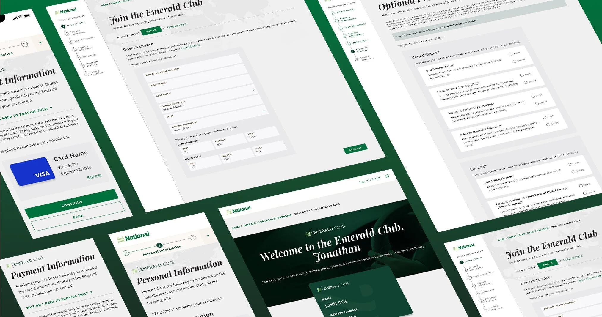
Nationalcar.com Account Creation
PRODUCT DESIGN
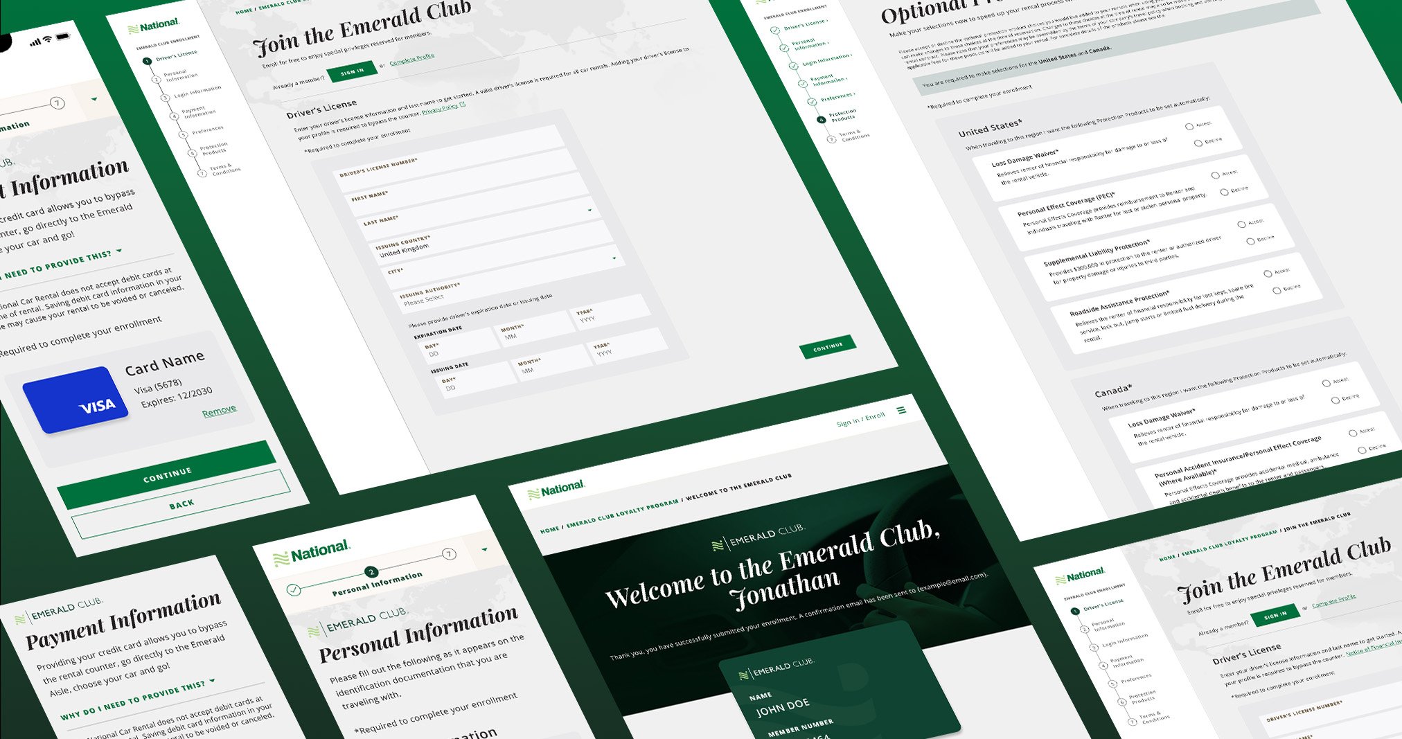
As the lead product designer, I reimagined and modernized the account creation experience for Nationalcar.com. Since signed-in users make up a majority of the car rental bookings at National Car Rental, our goal was to improve the enrollment experience by removing friction and decreasing errors.
After the new account creation experience went live, we recorded a 6.3% improvement of funnel completion rate and a 12% increase in users who reported being “Completely Satisfied” by the experience, surpassing both KPI goals.
Role
Lead Product Designer
Team
2 Product Owners, 2 Product Designers, 4 Developers, 1 Researcher
Timeline
July 2024 – June 2025
Key Issues
57% of users who start the enrollment flow abandon it before finishing
25% of users who struggle completely leave the site
ISSUE
Progress tracking is misleading
The progress indicators throughout the flow are unclear and misleading. Customers struggle with understanding where they are in the enrollment process and how much they have left.
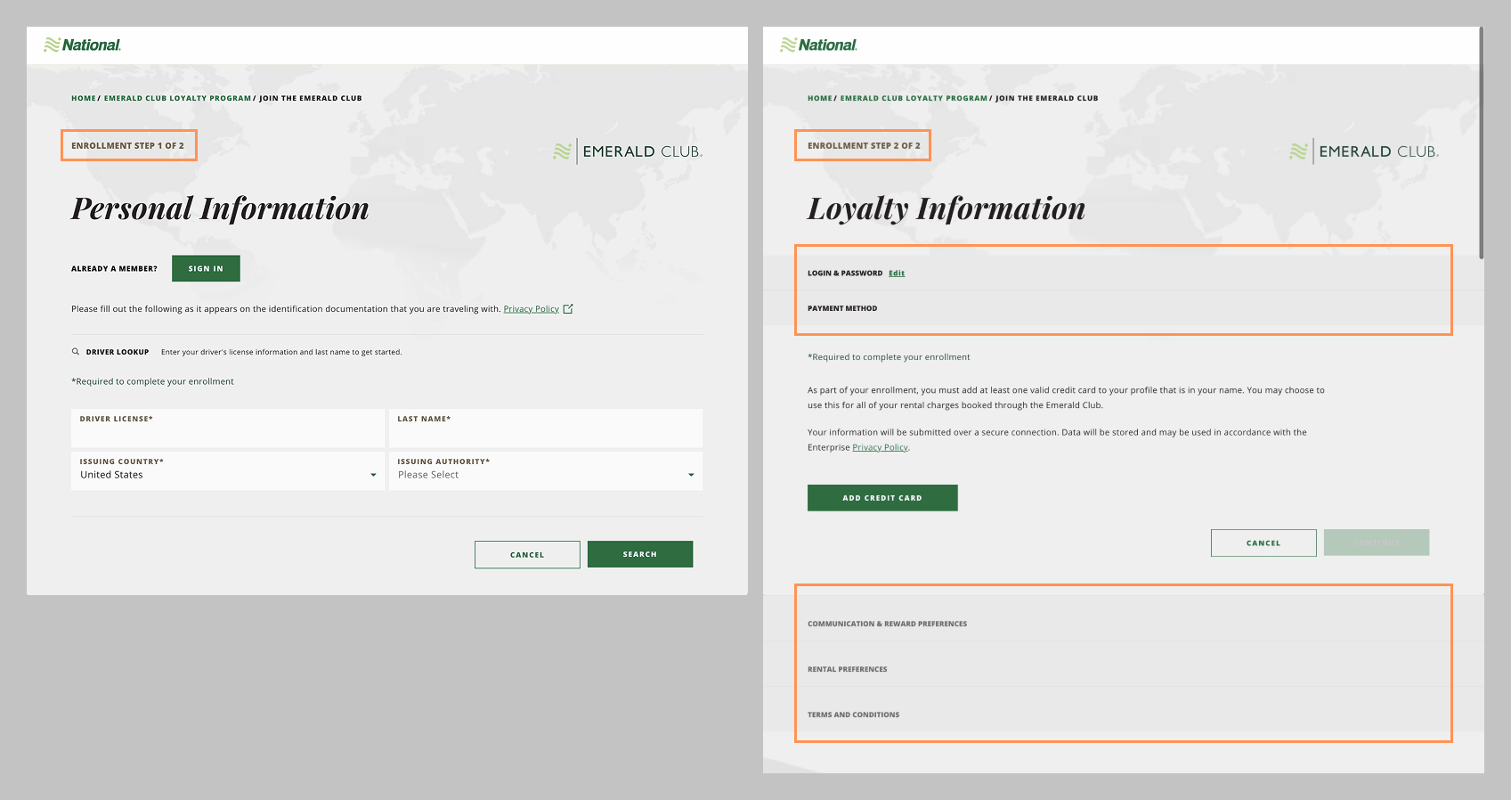
Current messaging indicates that there are 2 steps, but the 2nd page contains drawers with 5 additional steps. This can set a false expectation for users and cause frustration.
DESIGN FIX
Improved Progress Tracking
Tasks are now split into 7 equal steps that are indicated in the side bar progress tracker. The progress tracker is visible at all times, allowing the user to see what step they are on and how much they have left. Information about each step is revealed progressively to avoid overwhelming users.
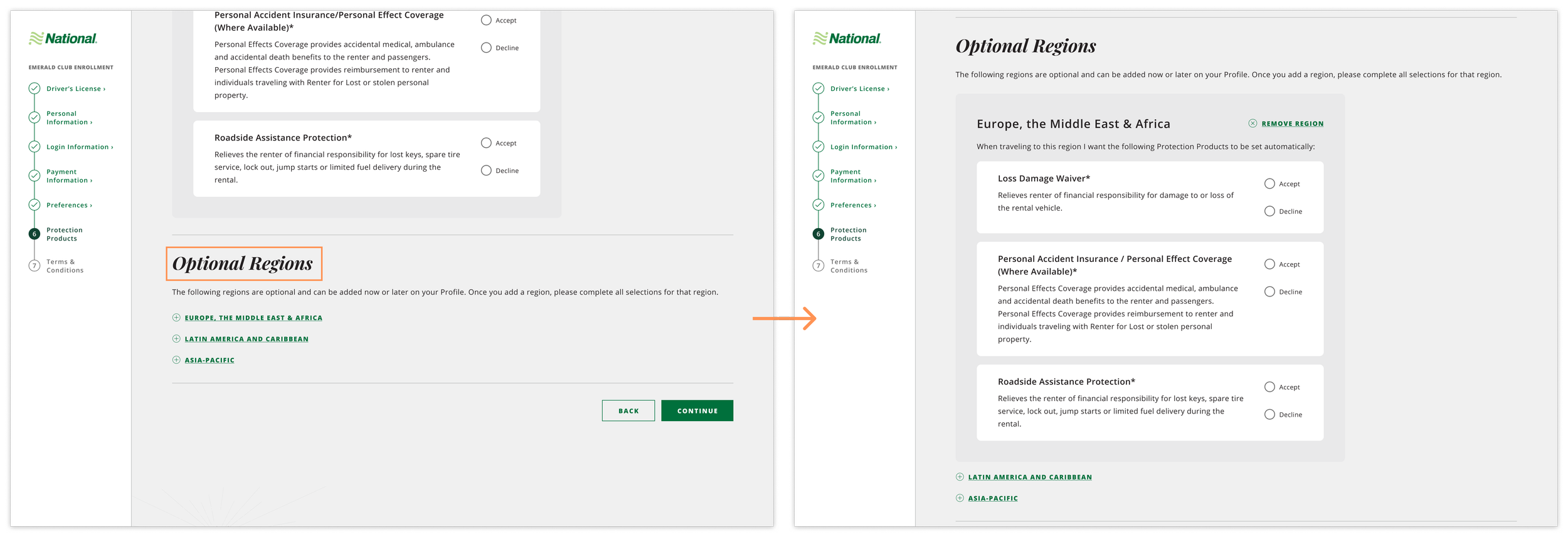
ISSUE
Unclear what selections are required
In the “protection products” section, users are required to make all selections for the United States and Canada regions, while the rest of the regions are optional. However, there is no clear indicator of this, which causes many users to get stuck on this step and quit the profile creation completely.
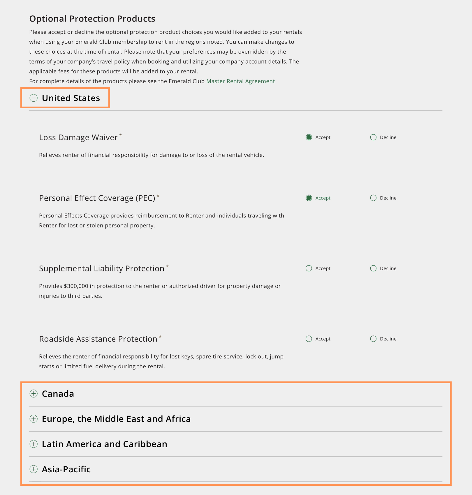
The Canada section, which is required, is closed by default, with no distinction from the optional regions.
DESIGN FIX
Required and optional selections are clearly distinguished
Required selections are prominently displayed and cannot be collapsed. The required regions are also clearly communicated with a banner at the top of the page and asterisks.
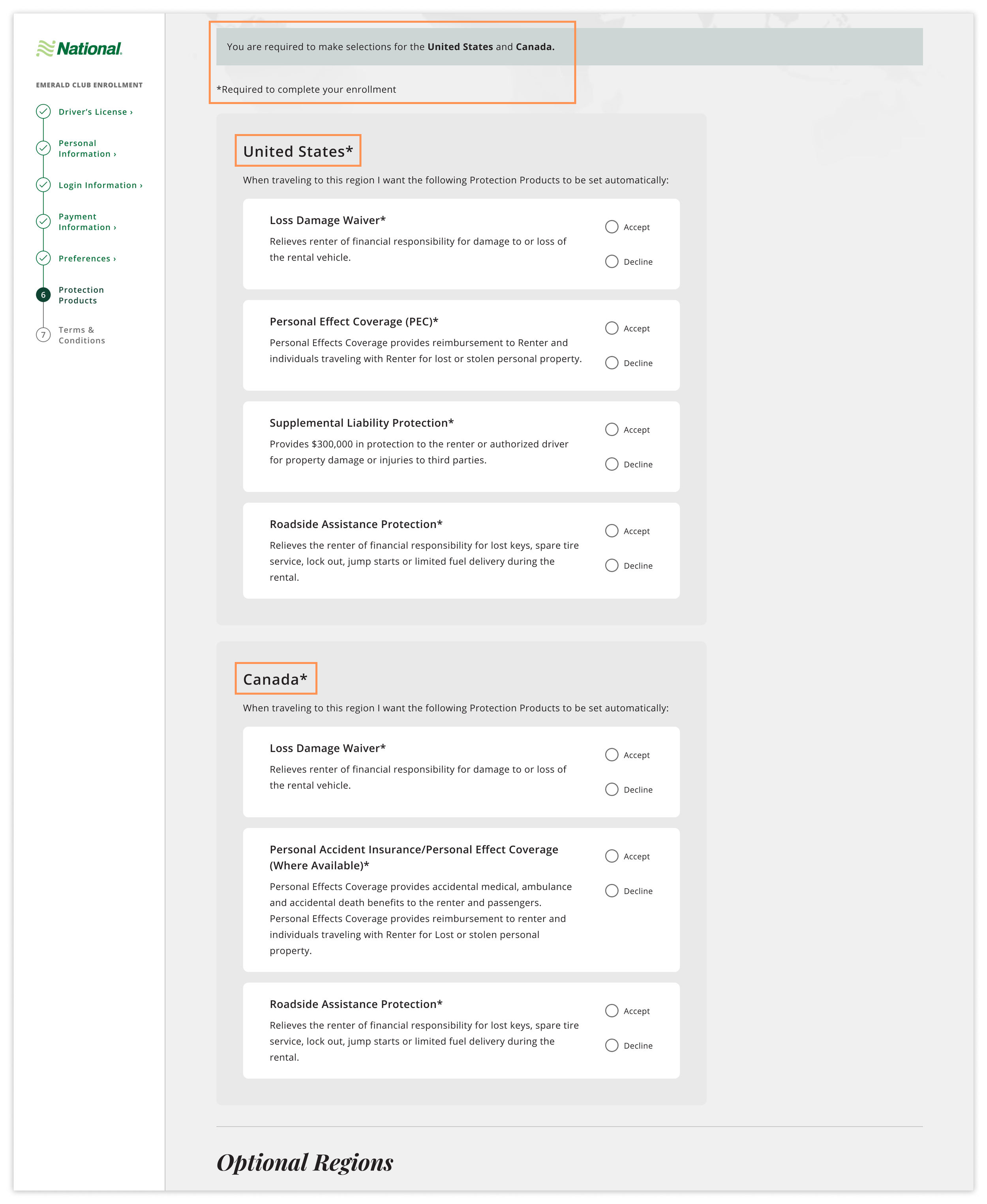
Optional regions are designated by their own section lower on the page. Their supplementary nature is communicated by using smaller links on the page.
Impact
After the new account creation experience went live, we recorded a 6.3% improvement of funnel completion rate and a 12% increase in users who reported being “Completely Satisfied” by the experience, surpassing both KPI goals.