
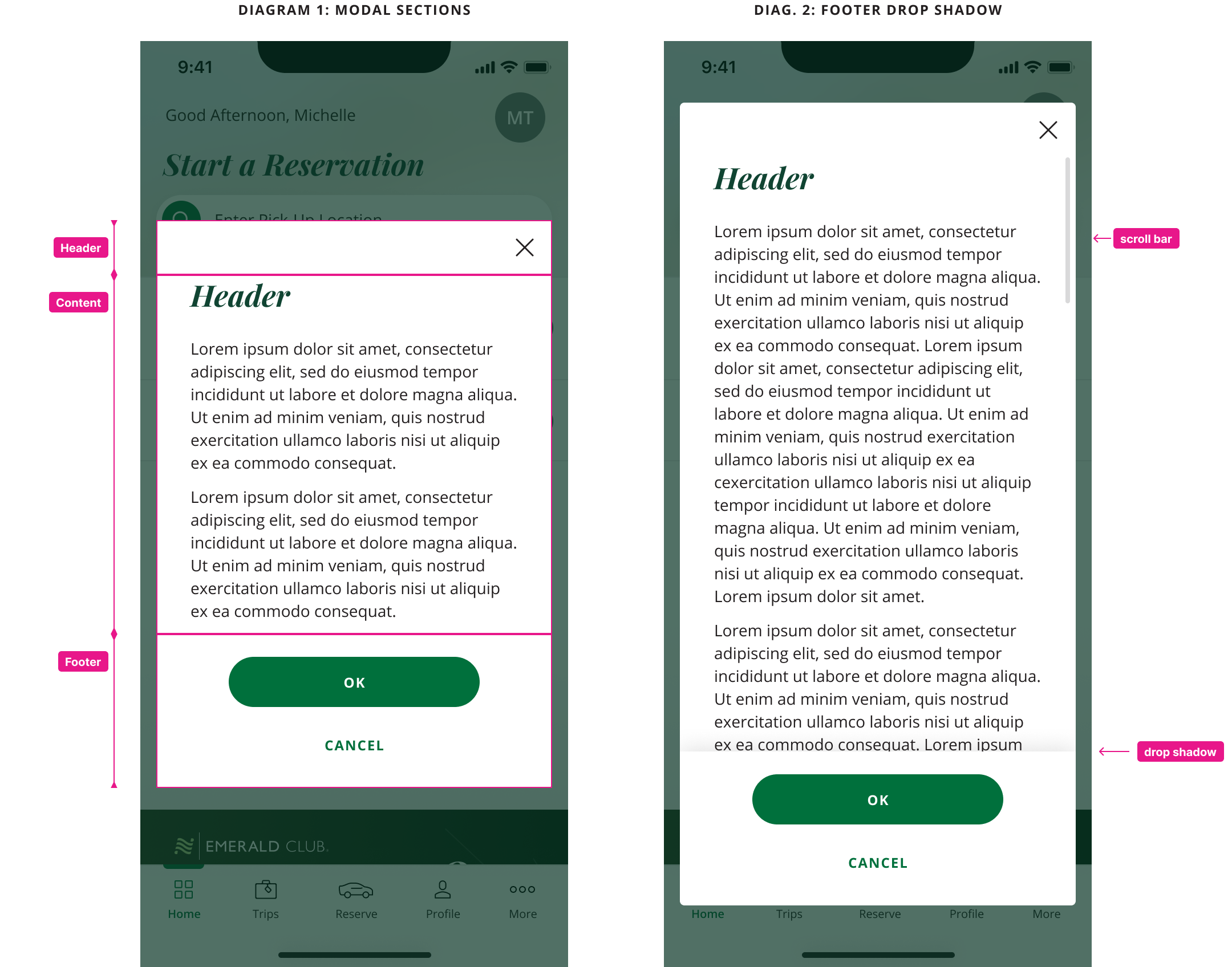
National App Modal Specs
UI & DESIGN SYSTEMS
As the lead product designer, I redesigned the functionality of the global modal component to address several past bugs and to improve the component’s flexibility. I then wrote detailed design specs for cross-functional team reference. I also created Figma components for the brand’s Figma library.
Role
Lead Product Designer
Team
1 Product Owner, 1 Product Designer, 3 Developers
Timeline
Feb 2025 – May 2025
No indicator of content “below the fold”
Sometimes, the height of the content within the modal is taller than can fit on the screen. This content gets obscured below the bottom of the modal. Because there are no strong indicators in the current component of this content, the user could miss that there is more content that they have to scroll to, causing frustration and task abandonment.
ISSUE
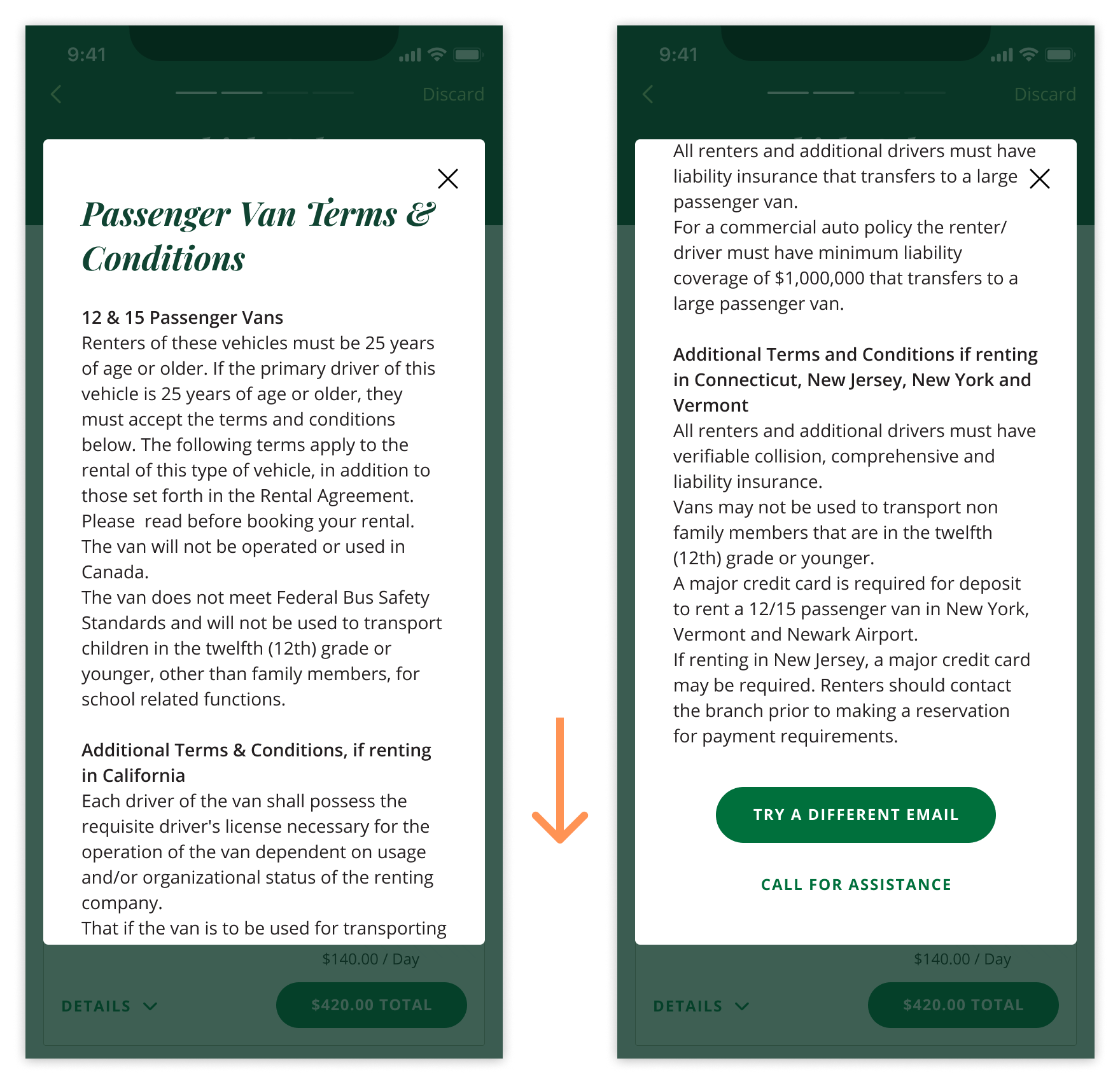
This additional text and buttons are cut off and could be missed by the user, leading to frustration.
DESIGN FIX
Sticky button footer
The new modal now contains a footer section that houses the action buttons. When the content within the modal is taller than the modal itself, this footer becomes fixed in place and has a drop shadow applied to it. This ensures that the action buttons always remain within view, and the drop shadow is a clear indicator to the user that there is more content that can be revealed by scrolling.
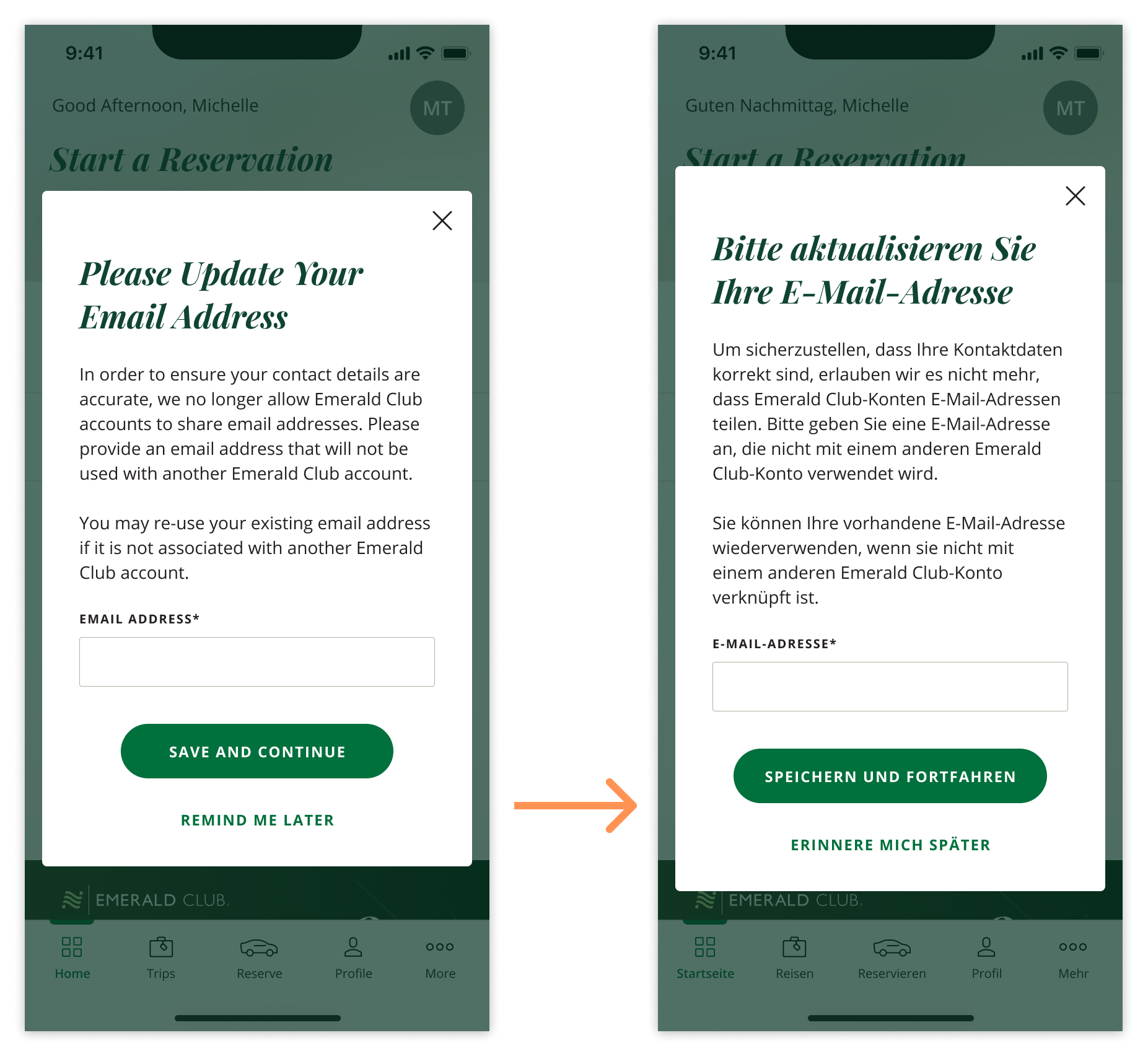
Inflexible modal height
For the previous modal component, each modal variant needed to have an fixed height set to it. If the height of the content inside the modal changed, for example due to language translations or text size increase, the modal height would not increase in size, potentially cutting off important content.
ISSUE
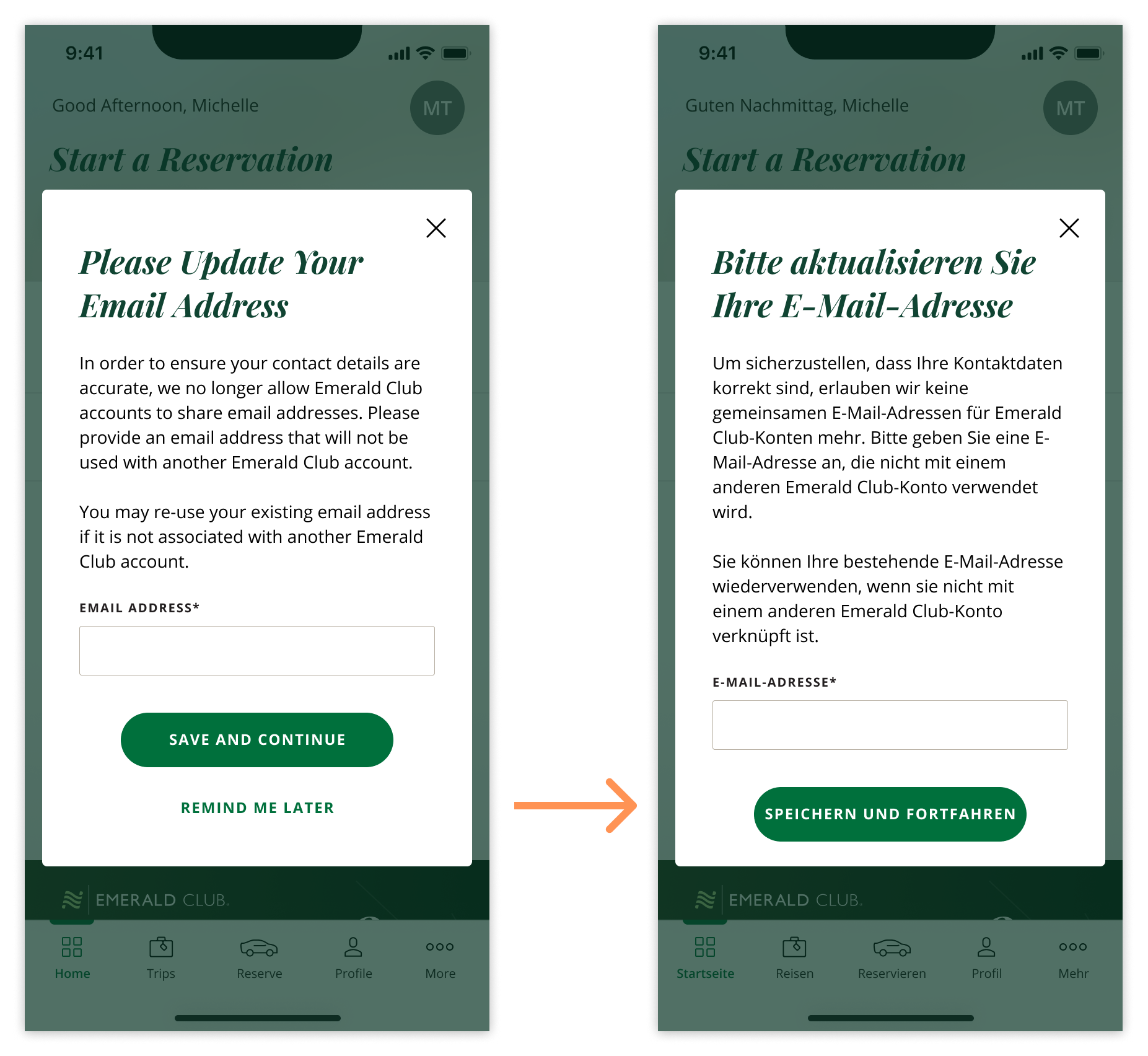
After the text is translated, buttons or fields could get pushed out of the container, which could prevent the user from accomplishing their task.
DESIGN FIX
Flexible component height
The new modal can now grow and shrink based on the content inside of it, by setting a maximum height for the component, rather than a fixed height. This maximum height also adapts to the device’s screen size and OS safe areas, ensuring the modal looks good on any device.
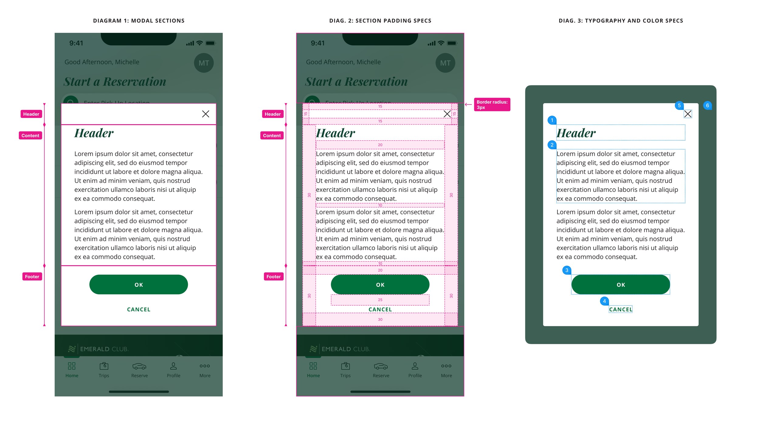
Final Specs
Impact
The new modal design has been successfully implemented into the app, fixing several issues we were seeing previously across the app. The new structure will provide a more flexible and adaptable component going forward, reducing the instances of user frustration and the number of bugs that arise due to this component.
“The modals look really good! This fixed the issues I was seeing before, and I’m really impressed by how clean and elevated this new UX/UI feels!”